The Fundamentals of a Good Slide Deck Presentation!

A good slide deck is not just a collection of nice-looking slides. It is a communication tool! It should help someone understand an idea, follow a story, make a decision or take action. Whether it is being used in a meeting, a pitch, a conference, a webinar or an internal update, the purpose is the same.

The deck needs to make the message clearer. That sounds simple, but it is where many presentations fall down. Too many decks are built around content first and audience second. Slides get filled with everything the presenter knows, rather than what the audience needs to understand. The result is a presentation that feels heavy, unclear or hard to follow.

A good slide deck does the opposite. It guides the audience through the thinking.
Start With The Audience

Before designing any slides, the first question should be; Who is this for?

A board presentation, sales pitch, investor update, leadership meeting and conference keynote all need different treatment. The audience changes the level of detail, the tone, the pace and the visual approach.

Senior stakeholders may need clarity and confidence quickly.
A sales audience may need a persuasive story.
An internal team may need direction and motivation.
A conference audience may need a strong visual experience.

The deck should not be designed in isolation. It should be built around the people who need to receive the message. If the audience is unclear, the presentation will be unclear too.

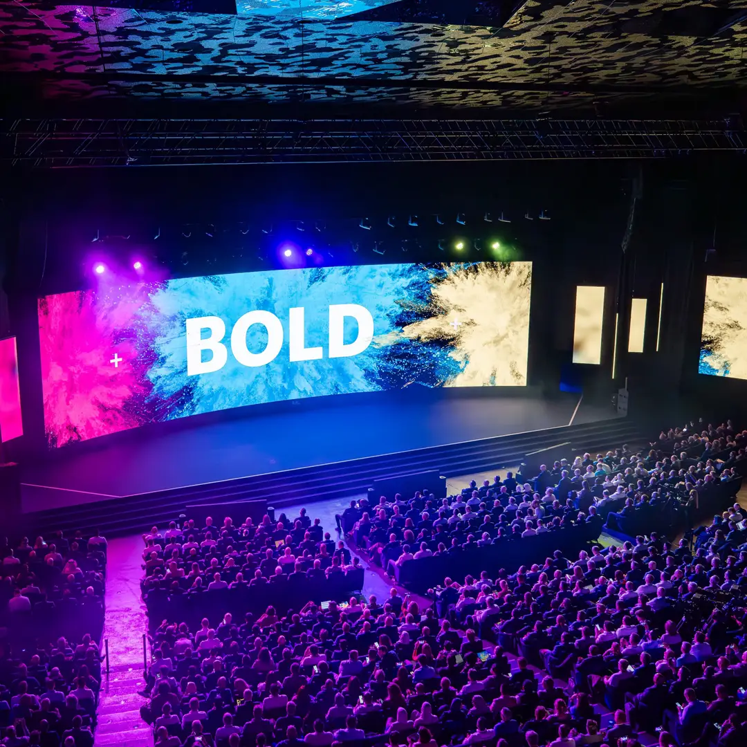
Large conference presentation with a bold visual slide displayed across multiple stage screens in front of a seated audience.

A presentation only works if the audience gets the point.

Know The Point Of The Deck

Every good presentation needs a clear purpose.

Is it there to inform?
Persuade?
Sell?
Explain?
Reassure?
Inspire?
Win approval?

Without a clear purpose, a deck can quickly become a dumping ground for information. Slides get added because they exist, not because they help the story. A good deck should have one main job.

Once that job is clear, every slide can be judged against it. Does this slide help the audience understand the point? Does it move the story forward? Does it support the decision or action we want? If not, it probably does not need to be there.

Structure Comes Before Design

Strong design will not fix a weak structure. Before colour, typography, imagery or animation, the deck needs a clear flow. The audience should be able to understand where they are in the story and why each section matters. A simple structure often works best:

Set the context.
Explain the challenge.
Show the insight.
Present the solution.
Support it with evidence.
End with a clear next step.

This does not mean every presentation has to follow the same formula. But it does need a rhythm. One idea should lead naturally into the next. If the structure is strong, the design has something to support.

One Slide, One Main Idea

One of the most common presentation problems is trying to say too much on one slide. When a slide has five messages, ten bullet points, three charts and a paragraph of explanation, the audience does not know where to look. The presenter may understand it, but the audience has to work too hard.

A good slide should have one clear job. That does not mean every slide has to be minimal. Some information may be detailed, especially in financial, technical or strategic presentations. But even complex slides need a clear hierarchy. The audience should be able to answer one question quickly: What is this slide trying to tell me? If that is not obvious, the slide needs more work.

Visual Hierarchy Matters

A presentation is read differently to a document. People do not study every word on a slide while listening to someone speak. They scan. They look for the headline, the key figure, the image, the chart, the emphasis. Visual hierarchy helps control that journey.

The most important information should feel the most important. Headlines should guide the story. Supporting detail should sit clearly underneath. Charts, icons and imagery should help explain the message rather than compete with it. Good hierarchy gives the audience confidence. It tells them where to look first, what to understand next and what to remember afterwards.

Think About How The Deck Will Be Used

Not every deck is presented in the same way.

Some decks are spoken to live. Some are sent after a meeting. Some need to work without a presenter. Some are used as internal documents. Some are adapted by multiple teams across different markets.

The format matters.

A live presentation can be more visual and less text-heavy because the presenter adds context.
A leave-behind deck needs more explanation because it has to stand on its own.
A sales deck may need flexible sections that can be tailored to different clients.
An event deck may need to work across large screens, speaker notes and show production.

A good slide deck is designed for its real use, not just how it looks on a laptop screen.

Design Should Support The Message

Good presentation design is not decoration. It is not about adding graphics to make slides feel more interesting. It is about making the communication stronger.

The right layout can simplify a complex idea.
The right chart can make a trend easier to see.
The right image can make a message more memorable.
The right use of space can help an important point land.

Design should give the content clarity, pace and confidence. A good deck should feel visually considered, but it should never make the audience work harder to understand the message.

Data Needs Interpretation

Charts and statistics are often used to add credibility, but data on its own is not always enough. A chart should not just show numbers. It should help explain what those numbers mean.

What is the trend?
What has changed?
Why does it matter?
What should the audience take from it?

If the audience has to interpret everything themselves, the slide is not doing enough work. Good data visualisation makes the message easier to understand. It removes unnecessary noise, highlights the key point and supports the wider story. The aim is not to show all the data. The aim is to show the right data clearly.

Consistency Builds Trust

A good deck should feel joined up from start to finish. That does not mean every slide needs to look the same. In fact, too much repetition can make a deck feel flat. But there should be a consistent design system underneath it.

Typography, spacing, colour, chart styles, icons, imagery and section breaks should all feel connected. Consistency helps the audience focus on the message instead of being distracted by the design. It also builds credibility. A deck that feels polished and controlled makes the presenter, team or organisation feel more confident and professional.

Think About How The Deck Will Be Used

Not every deck is presented in the same way. Some decks are spoken to live. Some are sent after a meeting. Some need to work without a presenter. Some are used as internal documents. Some are adapted by multiple teams across different markets.

The format matters.

A live presentation can be more visual and less text-heavy because the presenter adds context.
A leave-behind deck needs more explanation because it has to stand on its own.
A sales deck may need flexible sections that can be tailored to different clients.
An event deck may need to work across large screens, speaker notes and show production.

A good slide deck is designed for its real use, not just how it looks on a laptop screen.

The Ending Matters

Many presentations lose energy at the end. They build a strong argument, then finish with a generic thank you slide or a rushed summary. But the final section is where the audience needs clarity.

What should they remember?
What should they do next?
What decision needs to be made?
What action is being asked for?

A good ending should bring the story together and make the next step obvious. The audience should leave with a clear sense of what mattered and why.

Final Thought

A good slide deck is built on clarity.

Clear audience.
Clear purpose.
Clear structure.
Clear message.
Clear design.

When these fundamentals are in place, a presentation becomes much more than a set of slides. It becomes a tool for helping people understand, decide and act. The best slide decks do not simply look better. They make the message easier to follow, easier to remember and easier to believe. Because a presentation only works if the audience gets the point.

I’m Nick Farrow, a Senior Graphic Designer based in Brighton with over 30 years’ experience creating design for live experiences, presentations, digital platforms and brand communications. My work focuses on helping organisations turn complex ideas into clear, engaging visual systems that connect with their audience.

Find out more about my background and approach.

Need Help Turning A Presentation Into A Clearer Story?

I help organisations design professional slide decks, pitch presentations and event presentation systems that bring structure, storytelling and visual clarity to complex content.

Explore my Presentation Design services or get in touch to discuss how your next deck could work harder.