Why Most Reports Never Get Read

Reports take a lot of work.

They often involve weeks of research, interviews, data gathering, writing, editing and internal review. By the time they are finished, everyone involved is ready to get them signed off and shared. Then something frustrating happens.

The report gets published, sent around, uploaded to the website or attached to an email… and very few people actually read it properly. Not because the work is poor. Not because the subject is unimportant. But because the report is hard to engage with.

That is the problem. A report can contain brilliant thinking, strong data and valuable insight, but if it feels heavy, dense or difficult to navigate, people will skim it, park it, or ignore it completely.
The Issue Is Rarely The Content

Most reports fail because of how the content is presented.

There is often too much information fighting for attention. Long paragraphs. Repeated layouts. Complex charts. Pages that look the same from start to finish. The reader opens the document and immediately feels like work is being handed to them.

That is a problem because most people do not read reports in a calm, focused environment with unlimited time. They read them between meetings, on a train, before a call, or while trying to find one useful point quickly. Good report design understands this. It helps the reader move through the information without feeling overwhelmed. It creates structure, rhythm and clarity. It makes the important points easier to find, understand and remember.

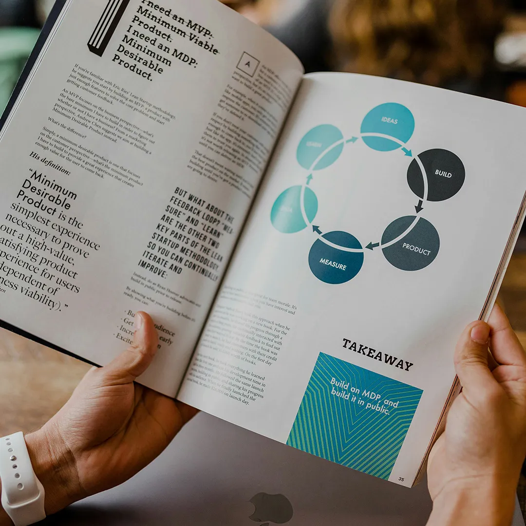
Reader viewing an editorial report spread featuring a circular product-development process diagram.

Data only has value when people can understand what it means.

People Scan Before They Read

Before someone reads a report properly, they scan it.

They look at the title. The contents page. The section headings. The charts. The pull-out stats. The summary boxes. The page structure. In a few seconds, they decide whether the report feels useful, credible and worth their time. If everything looks dense, they disengage.

This is why visual hierarchy matters. A strong report needs clear levels of information. Headlines should guide the story. Key statistics should stand out. Charts should explain, not decorate. Sections should feel distinct, but still connected. Design should not make the report look pretty for the sake of it. It should make the report easier to use.

Dense Pages Reduce Impact

One of the biggest mistakes in report design is trying to fit too much on each page.

It usually comes from a good place. Everyone wants the report to be thorough. Nobody wants to leave anything important out. But when every page is full of text, charts, notes and footnotes, the reader has no breathing space. The result is visual noise. A strong report does not need to say everything at once. It needs to guide the reader through the argument step by step.

That means using space well. Breaking up content. Creating pace. Giving important points room to land. White space is not wasted space. It is what helps the reader understand what matters.

Charts Need To Tell A Story

Data is often the strongest part of a report, but it can also be the hardest part to absorb.

A chart should not simply show that data exists. It should help the reader understand what the data means. Too many reports include charts that are copied straight from spreadsheets or research documents. They may be technically correct, but they are not always easy to read. The labels are small. The colours are unclear. The key message is buried. Good data visualisation asks a simple question:

What does the reader need to understand from this? Once that is clear, the design can support the message. The chart can be simplified. The key figure can be highlighted. The supporting text can explain the point in plain English. That is how data becomes insight.

Reports Need A Stronger Opening

A lot of reports start too slowly.

They open with background information, methodology, acknowledgements or internal context. These things may be necessary, but they are rarely the reason someone keeps reading. The opening pages should help the reader understand the value of the report quickly.

What is this about?
Why does it matter?
What are the key findings?
What should the reader take away?

A strong executive summary, clear contents page and well-designed opening section can make a huge difference. They give the reader a way in. If the first few pages feel useful, the rest of the report has a much better chance of being read.

Good Design Builds Credibility

Reports often represent serious work. Research reports, annual reviews, impact reports, investor documents, leadership papers and campaign publications all need to feel credible.

Design plays a major role in that. A poorly designed report can make good content feel weaker than it is. Inconsistent spacing, unclear typography, badly handled charts and clumsy layouts all affect how the information is perceived. A well-designed report does the opposite.

It gives the content authority. It shows care. It helps the organisation look professional, considered and confident. This is especially important when the report is aimed at senior stakeholders, boards, investors, clients, partners or the wider public.

The Best Reports Work Beyond The PDF

A report should not be treated as one static document.

The best reports create useful content that can work across different channels. Key findings can become LinkedIn posts. Charts can become social graphics. Pull-out quotes can support campaign activity. Summary slides can be used in presentations. Infographics can support internal communications. This is where report design and presentation design often overlap.

A strong report gives you more than a finished PDF. It gives you a communication system that can be used across meetings, campaigns, social content and stakeholder engagement. That makes the work go further.

Make The Report Easier To Act On

A report should help people do something.

Understand a topic. Make a decision. Share a finding. Support a campaign. Approve a recommendation. Invest in an idea. Change behaviour. If the report is hard to read, that action becomes less likely.

Good design helps reduce friction. It makes the message clearer. It helps the reader find the right information quickly. It turns a long document into something people can actually use. That is the real value of report design. Not just making pages look better.
Making the thinking easier to understand.

Final Thought

Most reports do not get ignored because people do not care.

They get ignored because they ask too much from the reader. A good report respects people’s time. It guides them through the information. It highlights what matters. It turns complex content into something clear, useful and memorable.

The content still needs to be strong. But strong content deserves strong design. Because a report that never gets read cannot do its job.

I’m Nick Farrow, a Senior Graphic Designer based in Brighton with over 30 years’ experience creating design for live experiences, presentations, digital platforms and brand communications. My work focuses on helping organisations turn complex ideas into clear, engaging visual systems that connect with their audience.

Find out more about my background and approach.

Need Help Turning A Report Into Something People Actually Read?

I help organisations design clear, professional reports, data-led documents and stakeholder presentations that make complex information easier to understand.

Explore my Report Design & Data Visualisation services or see how strong Presentation & Editorial Design can help turn your content into a clearer story.